

블룸버그 기사 요약
What’s Worse Than an Inverted Yield Curve?
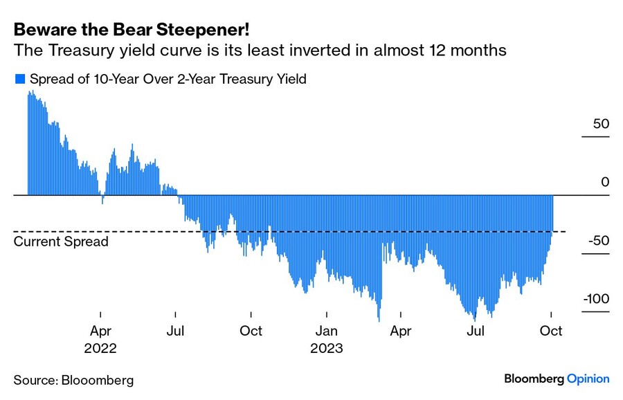
최근 장단기 금리차의 역전폭이 다시 급격히 좁아지면서 경기침체 우려가 커지고 있음
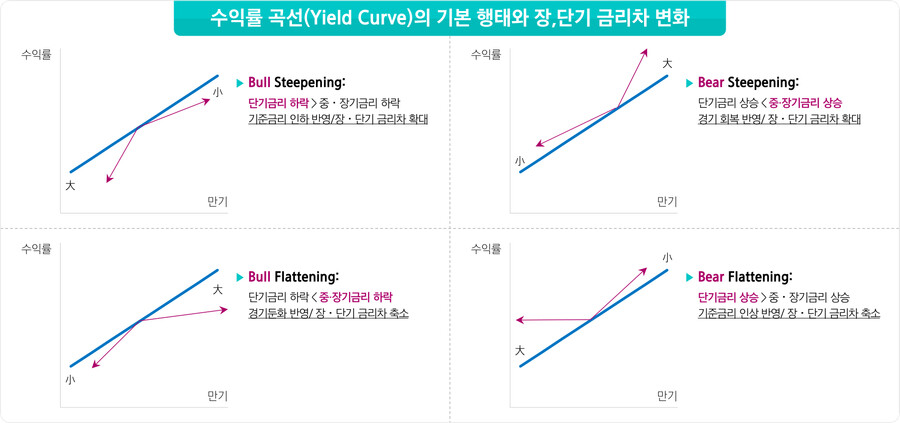
보통 장단기 금리 역전이 해소될 때는 단기 금리가 하락하는 경우가 대부분 (불 스티프닝)
하지만 이번에는 장기 금리가 상승하는 베어 스티프닝이 발생
장단기 금리 역전 상황에서 베어 스티프닝이 발생하는 건 매우 드문 일
이럴 경우 일반적으로 곧 경기침체가 닥쳤음 (장기 국채 금리/주가 지수 하락)
장단기 금리 역전이 경기 침체를 일으키는 이유는 은행 역마진 때문
하지만 오늘날 금융시장에서 은행의 중요성은 낮아진 상황
그래서 장단기 금리 역전은 잘못된 경기침체 신호일 수 있음
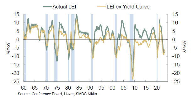
하지만 경기침체 여부를 판단하고자 할 때는 경기선행지수(LEI)도 고려해야 함
컨퍼런스 보드 경기 선행 지수에는 수익률 곡선도 포함됨
2008년 금융위기 이후 수익률 곡선을 제외한 LEI는 잘못된 경기침체 신호를 보내고 있었음
그러나 팬데믹 이후에는 수익률 곡선 포함 여부와는 무관하게 LEI가 경기침체 신호를 보내고 있음
이는 경기침체 예상을 강화하는 믿을만한 지표임
우리가 경기침체를 피할 수 있다면 매우 놀라운 일이 될 것
수익률 곡선이 급격히 좁아진다는 건 경기침체가 임박했다는 것을 암시
그러나 100% 확실한 건 아무 것도 없음
One More Analogy
1998년과 2023년이 비슷하다는 주장에서 얻을 수 있는 교훈
= 주가 상방 리스크
1998년 LTCM 파산으로 연준이 긴급 금리 인하를 실시
이렇게 풀린 돈이 TheGlobe.com 같은 이익을 내지 못하는 기술주의 급등으로 이어지면 닷컴 버블이 시작됨
국채 금리 급등에도 주가는 양호한 흐름을 지속하는 상황에서 무언가는 꺾일 것
1998년에 꺽인 것은 연준이었음
1998년과 2023년이 다른 점은 인플레이션 (현재 물가 상승률은 1998년 대비 2배 이상)
그렇더라도 연준을 비롯한 중앙은행들이 인플레와의 싸움을 포기할 위험은 남아있음
그것이 닷컴 버블 수준의 주가 상승을 의미하는 것은 아니지만 주가 업사이드 리스크라는 것을 염두해 둬야 함
=============================================================
As a sign of recession, this is when the relationship between two-year and 10-year Treasuries really gets dangerous.
2023년 10월 5일 오후 2:13 GMT+9
By John Authers
John Authers is a senior editor for markets and Bloomberg Opinion columnist. A former chief markets commentator at the Financial Times, he is author of “The Fearful Rise of Markets.”

Stormy harbinger for the yield curve? Above: Near Santa Ynez, California.
Photographer: George Rose/Getty
What’s Worse Than an Inverted Yield Curve?
For 15 months now, the yield curve has been inverted. In English, that means 10-year Treasury bonds have been yielding less than two-year bonds, even though investors normally require an extra yield for the extra risk for investing over long periods. As is now widely known, an inverted curve is one of the strongest recession indicators there is. An inversion so protracted implies serious problems afoot.
The spike in bond yields over the last few weeks, however, has been accompanied by a swift dis-inversion. The curve was inverted by 107.5 basis points (meaning that two-year exceeded 10-year yields by this much), as recently as July. Now that number has dropped to 31.7 basis points, the least inverted curve in almost 12 months:
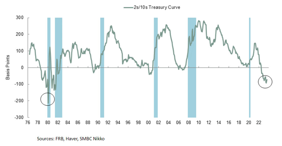
And this is a shame, because the yield curve tends to dis-invert when the recession is about to start. (The intuition behind why this might be is that when a downturn is clearly imminent, central banks begin to cut rates, bringing down shorter-dated bonds.) The following chart from Joe Lavorgna of SMBC Nikko confirms both that the curve inverts before each recession and also that the inversion is usually over by the time the recession, as officially defined by the National Bureau of Economic Research, begins:
This sounds scary. But now we need to add another element. As discussed, curve dis-inversions often happen because shorter yields come down. In the jargon, that is a “bull steepening,” because a rise in two-year prices (bullish if you hold them) leads to the steepening. This one is different. It’s a bear steepening, meaning that the move has been driven by a fall in the price of long-dated bonds. Further, this is a specific kind of bear steepening that starts with the curve inverted.
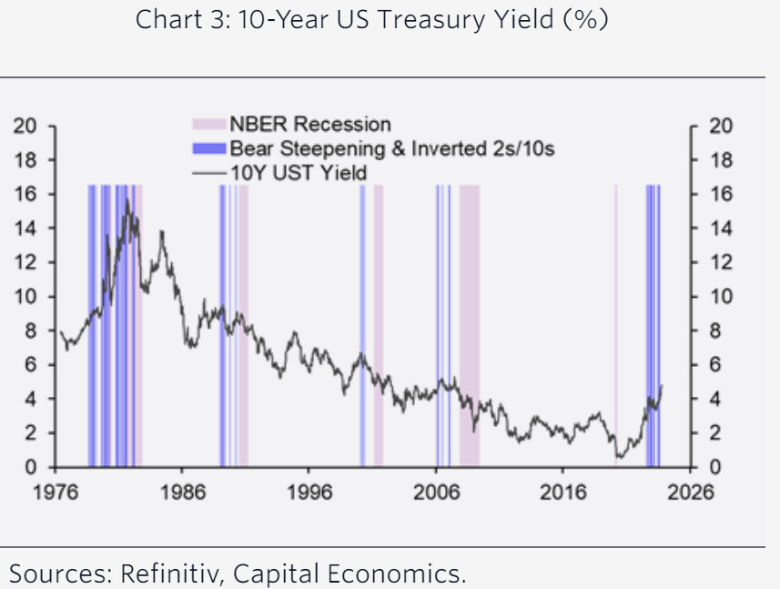
That combination of conditions happens very rarely. When it does, the following chart from Capital Economics demonstrates that a recession generally soon follows. For markets, Capital Economics concludes, such bear steepenings have generally “been followed by significant falls in long-term government bond yields, as well as equity indices.”
But why exactly should we care about the yield curve? Theoretically, by making it harder for banks to make profits, it’s causative. The inverted curve can bring about a recession. But banks are less central to the financial system than they once were. The inverted curve is an issue for financiers, but it hasn’t significantly affected the everyday financial conditions for most families and companies. It’s possible, even, that it’s now become a false indicator. Now that the significance of an inverted curve is well known, it can change behaviors — and thus dampen the risk of a recession.
But the yield curve doesn’t stand on its own. The Leading Economic Indicators produced by the Conference Board have been subject to criticism (covered in Points of Return earlier this year), as they largely collate information that is already known. They also include the yield curve, which some now allege to be a broken indicator. So in the following chart, Lavorgna calculated the year-on-year change in the LEI as it is currently measured (경기 선행 지수 구성 요소는 계속 변경됨), as well as for an LEI in which the yield curve had been excluded. It looks like the yield curve saved the LEI from sending out an incorrect recession warning for much of the post-Global Financial Crisis decade (when the economy was often sluggish but remarkably easy financial conditions did indeed thwart a recession). But since the pandemic, the LEI appears to be almost identical with or without the yield curve. This is a reliable indicator that should buttress our expectation of a recession:
Bottom line: It would still be very surprising if we escaped from this economic hole without a recession. The speed with which the curve is now steepening suggests, all else equal, that the downturn is close. But nothing is certain.
One More Analogy
Thanks for the feedback on yesterday’s piece about the echoes of 1987 that show up in many charts of 2023. Overlay charts count as “chart crime” for some, and it would certainly be unwise to put much weight on them. But one counter-example sent to me on X, the social media site formerly known as Twitter, may in fact add to our understanding of what could lie ahead.
It concerns 1998, the year the modern-day Citigroup and Bank of America were formed in massive mergers, Russia defaulted, and the Long-Term Capital Management hedge fund melted down, all while the Federal Reserve chairman of the day, Alan Greenspan, was prepared to speculate in public on the notion that there might be a “New Economic Paradigm.” Someone calling themselves “The Bison” on X commented as follows:
"Obviously, overlaying a historical chart that looks similar has no predictive value. Here's my bullish thesis, it's as useless as your bearish one."
There followed this chart comparing the Nasdaq’s performance in 1998 to 2023:
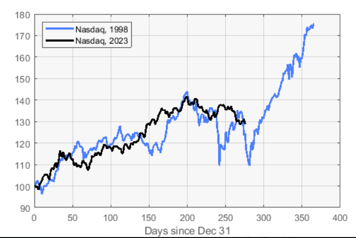
I’m not sure this proves what The Bison thinks it does, although it certainly demonstrates that there’s a precedent for the Nasdaq performing much as it has done so far this year, and then suddenly heading off for the moon. Overlay charts aren’t predictive on their own. Context is critical. Once it’s added, I think this chart does give us some useful guides.
For me, one of 1998’s most indelible memories was the IPO of TheGlobe.com. Priced at $9 per share at its launch on Nov. 13, the price surged at one point to $92, valuing it at $841.5 million. Over the previous nine months, the company had generated revenues of $2.7 million. It had never, of course, made a profit. That was the moment the great Dot-Com Boom turned unmistakably into a bubble.
Prior to that, an even more memorable moment came in the afternoon of Oct. 14,when the Fed suddenly announced an inter-meeting rate cut with about an hour of trading to go. They’d capitulated. Prior to this, the Russian default had caused the meltdown of LTCM, which was rescued without public money at the instigation of the Fed in early September. But by mid-October, fixed income had ground almost completely to a halt. The stock market didn’t show great signs of stress, but financing conditions were growing extreme.
It was the most palpable and immediate turn in sentiment on financial markets that I’ve ever witnessed. Here are all those incidents on a chart, with 2023 overlaid:
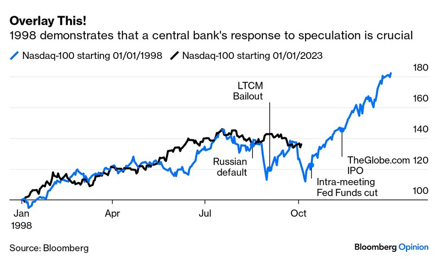
I think it says something more useful now. When the stock market has roared forward like this, and yet there are signs of great stress in fixed income markets, it’s a sign that something is going to have to give. In 1998, that was the Fed. Money is fungible, and a rate cut meant to re-liquify the credit markets soon directed a gush of money into dot-com startups. Once TheGlobe.com had clearly shown to all and sundry how much money was available to invest in companies that had barely ever made a dime, the Nasdaq had liftoff.
One other vital piece of context is that inflation was totally under control. It was at 1.5% when the Fed made its fateful inter-meeting cut. It’s more than twice that today, and the Fed also now has the advantage of hindsight. It’s not likely to capitulate, or at least not quite as dramatically as in 1998. But the risk remains — and it’s what many assumed in the wake of the regional bank failures in March — that the Fed and other central banks could throw in the towel on fighting inflation. It doesn’t necessarily follow that we would then have a bubble to match the dot-coms, but it’s an upside risk for stocks and a possibility that all must bear in mind.